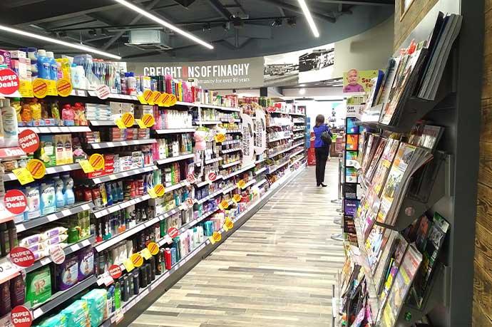
Visitors come into a retail store wanting to browse items, sometimes without any intention of buying. Yet, think how many times you’ve gone into a convenience store for milk and ended up not seeing much change out of £20. What are these dark arts at play? In this article, we attempt to demystify the tactics employed by merchandisers, so that you can implement them within your shop or supermarket too.
Optimise your store layout
Everyone who has ever strolled through an IKEA store knows how important layout is. You know you can’t just pop in to buy a candle – You have to walk the entire course of the store – a one-way loop where you’re forced to see everything.
While not everyone can be IKEA, there are lessons here for all retailers in good store design. In fact, while they don’t tend to adopt one-way systems, supermarkets apply a similar philosophy of guiding customers through the product locations they want them to see. They achieve this by placing mundane but necessary products towards the back of the store so you have to see more merchandise on the way. It’s all about creating opportunities for impulse buys.
Starting with the doorway, you enter the “decompression zone” where you put your promotional products in a prominent location. This area should offer a sense of space and showcase the best the store has to offer.
The “right turn” is something else to be aware of. The vast majority of customers go to the right once they’ve entered the shop, so your displays on the right must be eye-catching, exhibiting your signature items on the so-called “power wall”.
Just like IKEA, you can create a perceived path that will lead customers past the retail displays you want them to see. You can use contrasting colours in your floor tiles to encourage them to follow the route you’ve subtly laid out.
Finally, the checkout area is the ideal location for some last-minute impulse buys, so create opportunities to showcase additional products near the tills. The customer hasn’t got time to use their logic at this point and the emotional pull will win out.
Be deliberate about where you place your goods
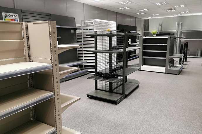
Besides displaying your high-ticket items near the front and on your power wall, consider your product placement within the store shelving structure itself. Merchandisers don’t put goods out in an ad hoc fashion, anywhere it will fit. They are accustomed to using our psychology against us, thus getting us to open our wallets.
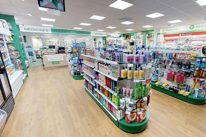
They recommend displaying the more expensive items eye-level so they are the first products you take notice of. In addition, it’s easier for the customer to pick up a product from the middle shelves, so this area should be reserved for the products you most want them to buy.
The upper store shelving is for cheaper brands that don’t bring in as much revenue, and bottom store shelves are for bigger products it would be dangerous to place high up.
Ends of aisles are another area set aside for products you want to attract most attention to. Ideally, these should be changed regularly in line with your current promotions and also to create a sense of novelty.
Your retail displays benefit from cross-merchandising – that is putting goods together that don’t necessarily belong in the same product category, and yet they are often bought together. For example, a cookery book, a rolling pin and a packet of pastry mix. These items live in different parts of the store, but placing them together increases the likelihood that all three will be bought.
