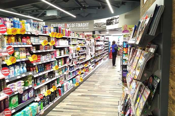
Too many retailers still think of shelving as a commodity: metal boxes you can buy anywhere, as long as they’re roughly the right size and cheap enough.
The reality is very different. Shelving is the main physical interface between your brand and your customers. It frames every product, defines how the store feels, and sets the tone for whether people see you as basic, value, premium, or something in between.
Get the colour and finish right – in coordination with lighting and architecture – and you get a store experience that keeps footfall high, builds loyalty and supports sales growth. Get it wrong and no amount of clever range strategy will quite land.
Shelving as a brand tool, not just hardware
When a store “feels right” from a brand point of view, it’s rarely an accident. You can see that:
- The colour of the fixtures is working with the building, not fighting it.
- Products are the heroes, not the steel.
- The finer details – trims, finishes, textures – have been taken care of, even if most customers can’t articulate why it feels better.
On the other side, you still see stores where:
- Everything is default white or beige, regardless of the architecture or location.
- Or, heavy dark colours are used without thought, making the shop feel smaller and killing light.
- Or, fixtures from different suppliers fight each other visually – different tints of “white”, different gloss levels, clashing greys.
This is what happens when shelving is treated as a throwaway commodity. You tick the functional box and leave a big chunk of brand potential on the table.
What CAEM can do with colours and finishes
Because we design and manufacture, we have a lot more control over colour and finish than a typical reseller. Over the years, we’ve built up three levels of choice:
15 standard colours
- Our everyday palette for quick, consistent specifications.
- Suitable for most mainstream environments.
Around 100 ready-to-go architectural colours
- Developed with our powder manufacturing partners.
- Available in different textures (smooth, fine texture, matt, gloss) and metallic effects.
- This is where clients who care about design start to have fun.
Formulated custom powders
- If the existing range isn’t enough, we can formulate a bespoke powder to hit the exact tint and texture a client wants.
- That means, if your architect or brand team has a very specific vision, we can match it – not approximate it.
These options don’t sit in a separate “luxury” category. They’re integrated into how we work.
Real examples: when colour and finish changed everything
High‑end supermarkets in London
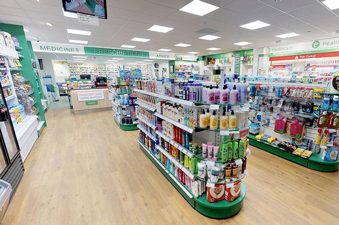
One client with high‑end supermarkets in London made a very deliberate choice: they chose different colours of shelving and fixtures for each store.
- Each site had a distinct architecture, light level and local character.
- Instead of forcing one standard colour everywhere, they used fixtures as a way to complement each building.
- They went beyond our 15 standard colours and the usual RAL range, drawing from our extended architectural finishes.
The result:
- Stores that feel tailored and intentional, not stamped out of a template.
- A stronger sense of place and brand for each location.
- A fixture package that still works technically and operationally like a standard CAEM system – because under the skin, it is.
Metallic dark stores that made product pop
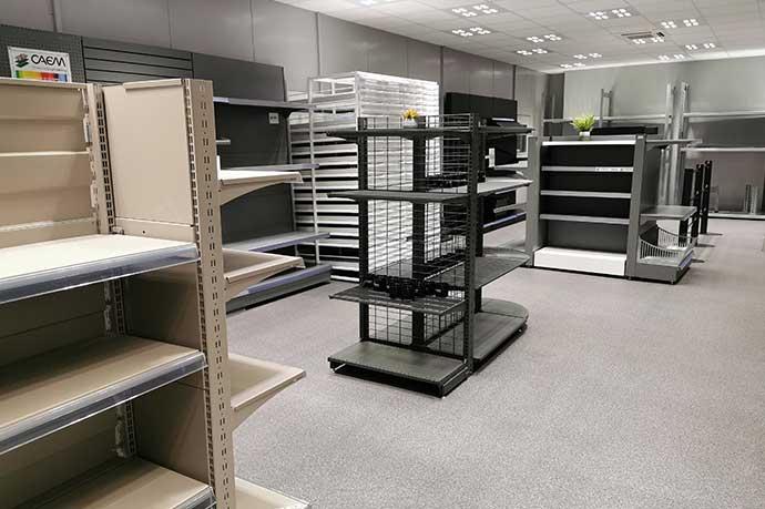
In another case, we did stores where the client adopted specific metallic dark finishes.
- On paper, dark fixtures can sound risky – too heavy, too gloomy.
- In reality, when done properly with the right metallic effect and the right lighting, they made the products stand out dramatically.
- The product, not the shelving, became the brightest thing in the field of view.
The client saw a noticeable lift in sales and a very strong reaction from customers. The environment felt unique and modern, not oppressive.
Architectural pearl-white elegance on modular systems
Another retailer chose an architectural finish with a pearl white–ish effect.
- It delivered an extremely elegant environment – the kind you’d normally expect from fully bespoke, high‑end joinery.
- But underneath, it was still modular CAEM shelving and fixtures:
- Adjustable
- Repeatable
- Cost‑effective to manufacture and roll out
This is where design and practicality meet: you get the refinement of an interior designer’s vision with the economics and flexibility of a proven modular system.
Hidden quality: finishes that last, not just look good on opening day
Colour is not just about the visible tint. The quality of the powder and how it behaves on complex parts makes a big difference over time.
A good example is wire shelving:
- Wire shelves and baskets have many intricate crossing points, where conventional powders can struggle to cover properly.
- If those areas are thinly coated, you get premature rust, chipping and a tired look long before the rest of the system wears out.
We deliberately went beyond standard powders and developed micro‑granularity powders:
- They flow and cover exceptionally well around these complex wire intersections.
- You don’t notice this on day one. Most clients don’t think about it at first.
- But over years, it delivers real durability and quality – fixtures that still look and feel solid, not scuffed and rusty.
Our longest‑standing clients – those who’ve worked with us for 20+ years – do notice this. They can see the difference in how CAEM fixtures age compared with others they’ve used.
Why colour and finish aren’t “cosmetic fluff”
From a cost‑focused point of view, it’s easy to dismiss colour and finish as “just cosmetics”. My view, backed by years of finance and site experience, is the opposite:
The extra cost over a basic standard is often minimal or zero when you work with a manufacturer like CAEM that already holds a wide palette and offers custom colours as part of the project.
The impact on perceived quality is huge:
- Customers judge the whole store by how the fixtures feel and look.
- Clean, coherent, well‑finished metal suggests care and professionalism.
- That perception carries over to how they see your products and prices.
The impact on clarity and sales is real:
- Good contrast between product and fixture colour makes ranges easier to scan.
- Thoughtful use of dark vs light grounds changes how “full” or “premium” a bay feels.
- Category colour coding, when subtle, can guide shoppers without shouting.
In other words: you are paying very little for a powerful, permanent part of your brand expression.
How to approach colour and finishes with CAEM
The most effective projects usually follow a simple pattern:
Start from the architecture and lighting
- What is the building like? High ceilings, low ceilings, lots of daylight, more artificial light?
- Is the space warm, cool, industrial, historic?
Decide the role you want fixtures to play
- Do you want them to recede and let products float?
- Or be a strong, visible part of the brand language?
Use our palette as a toolkit, not a limitation
- Start with our 15 standards if you want speed and simplicity.
- Explore the ~100 architectural colours when you want more character.
- Formulate a custom powder only when you need a very specific effect.
Lean on our experience
- We’ve seen what works and what doesn’t in hundreds of stores.
- We know when a dark metallic will make product pop, and when it will kill the space.
- We can show you how a pearl finish or a texture behaves in real retail conditions.
Shelving will never be “just a commodity” in the eyes of customers. It’s the frame through which they see your brand. If you’re already investing in design, lighting and architecture, it makes no sense to leave that frame as an afterthought.
With the right colours and finishes, you can turn standard, efficient modular fixtures into a powerful, quiet expression of who you are – and that, in retail, is worth far more than the marginal cost of the powder.
